I've always been a fan of minimalistic, be it in web design, in work or in life.
However, I'm not the type of designer but more of commenter. I can't design something new but I can tell whether this design looks good or not and where it needs to improve.
I randomly discovered some very nice websites and then "borrow with proper acknowledge" their design into my personal blog.
Here are a few examples
Mootools website - Last design (I prefer this over the current one)

current Mootools design

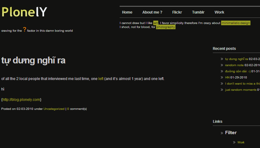
Hyalineskies website - I also prefer his last design but couldn't find it anywhere. So here is the screenshot of my blog that borrowed his design, the original one looks even much better

his current design

the template I last used for my blog

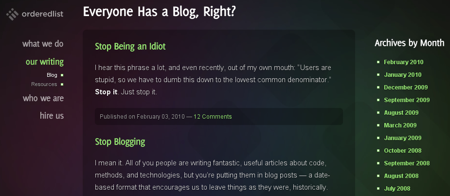
OrderedList website, where I borrow the current design for my blog

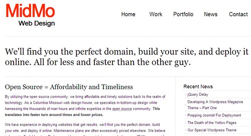
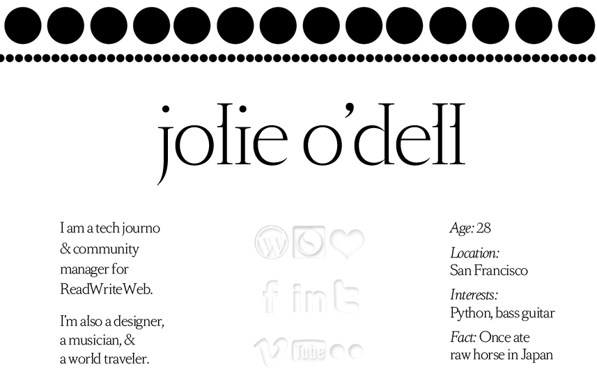
bonus screenshot, just some random website I discovered today. always like the way those people describe themselves, very original

I really such a diversified profile (e.g. Python and bass guitar, tech journo & world traveler)
And Lud just told me that she opened Floramisu after reading "Đường còn dài còn dài". it's nice.